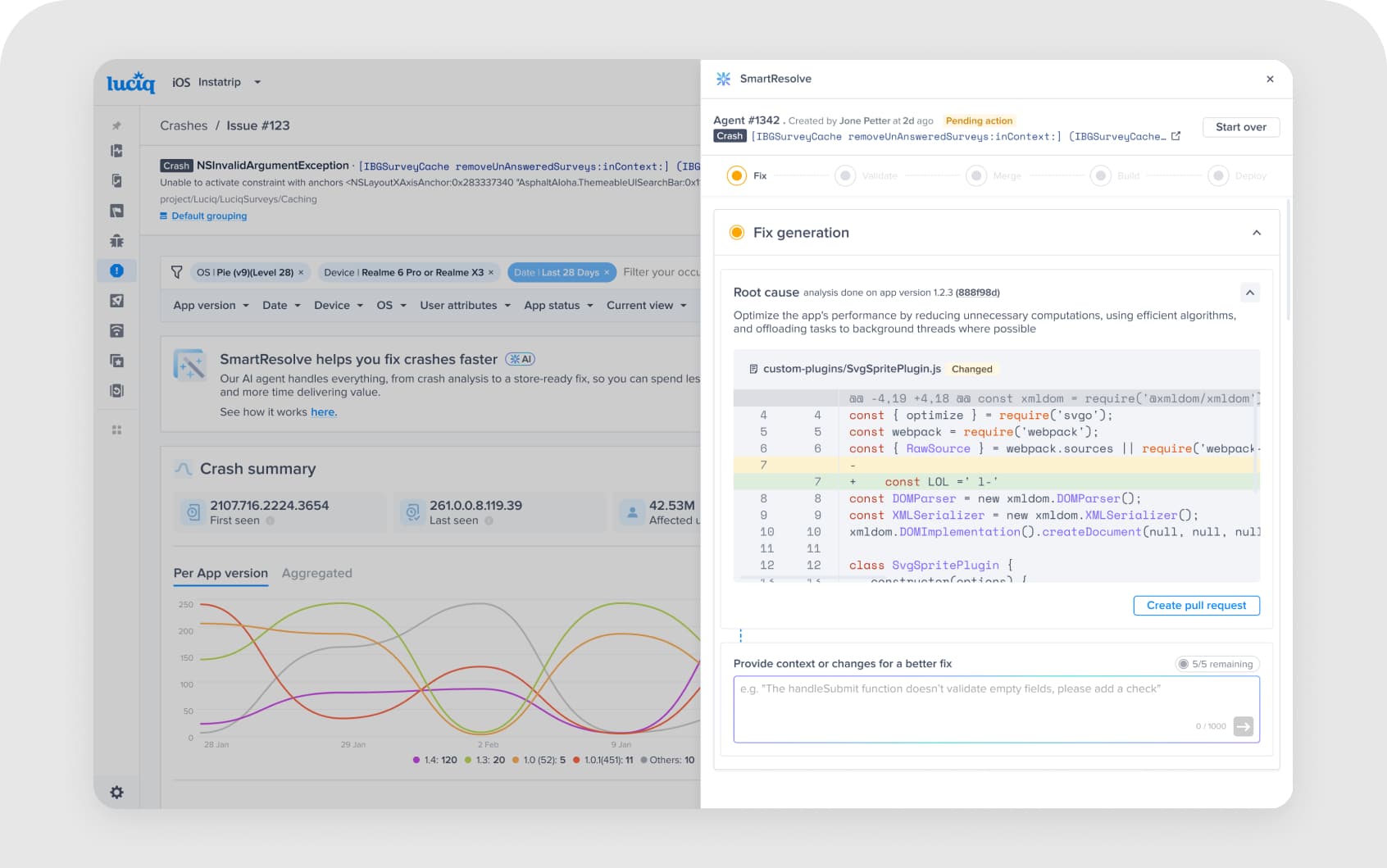
Redesigning Session Replay List
Optimizing the developer debugging flow for enterprise adoption. The redesign doubled active enterprise customers from 7 to 14 within four months.
Company
Luciq / Instabug
Role
Product Designer
Timeline
2 sprints
Team
PM, Researcher, EM, Developers
Overview
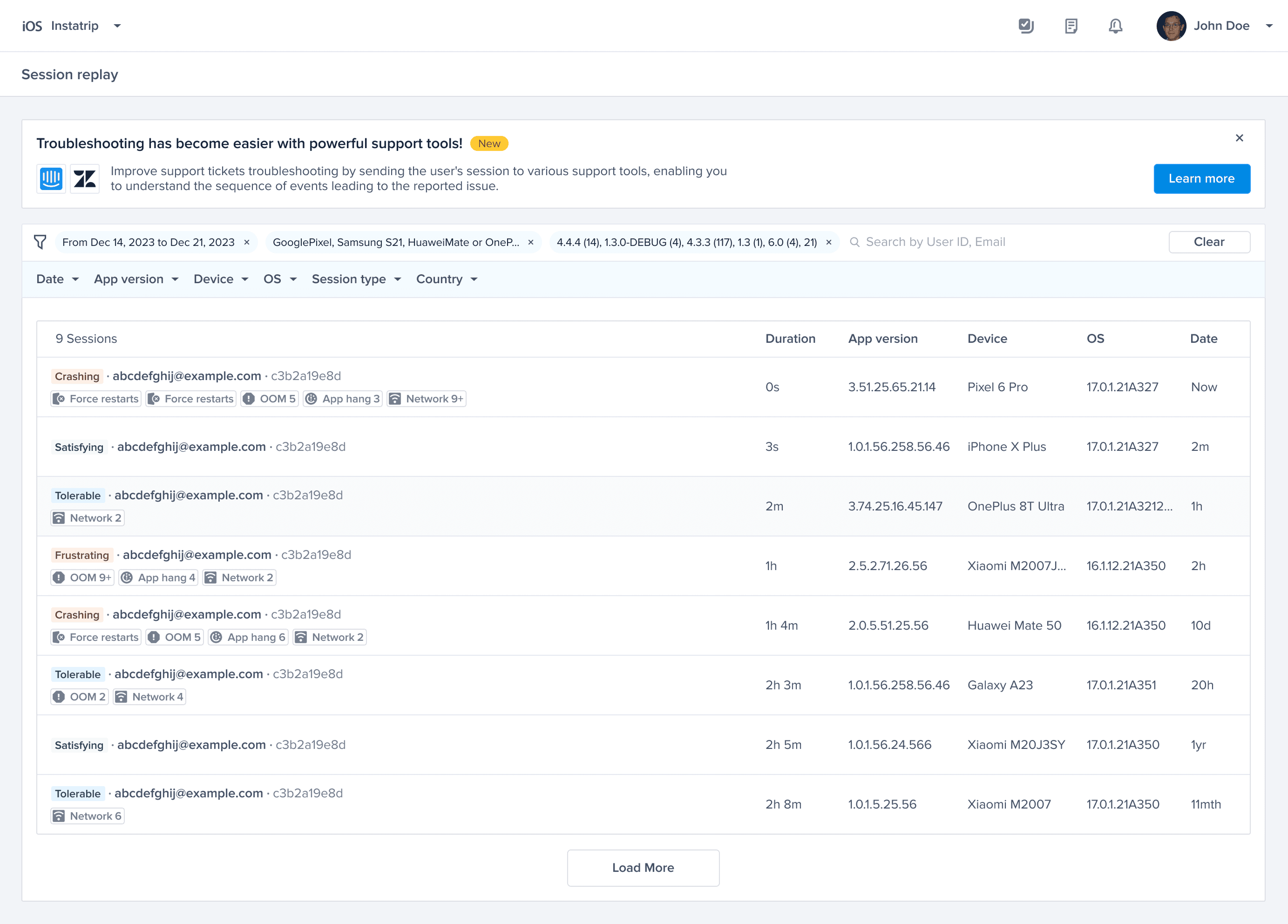
At Instabug, Session Replay is a core tool for developers and product teams to diagnose user behavior and issues. However, the Session Replay list view lacked clarity and immediate interpretability, especially for new users. This project aimed to enhance the readability and usefulness of the list by making parameter labels more intuitive and visually restructuring key components based on user data and feedback.
The process
From research to handoff.
A 5-stage process designed to align research, design, and engineering on shared signals.
Empathize
Research
Define
Problem Framing
Ideate
Squad Pre-planning
Test
Usability Testing
Implement
Iteration & Handoff
- →Dig into complaints, logs, usability data
- →PM sync, define problems from customer insights or competitive gaps
- →Frame the problem space and clarify scope
- →Technical alignment, early check with EM to avoid blockers
- →Refinement and sync with PM and squad
- →Design Chapter feedback, share with designers for cross-product impact
- →Run light tests in customer sync calls
- →Product Review, present to PMs, EMs, CPO, CTO for feedback
- →Refine, handoff to devs, and support implementation
Hover a stage to expand
Empathize
Research
- →Dig into complaints, logs, usability data
- →PM sync, define problems from customer insights or competitive gaps
Define
Problem Framing
- →Frame the problem space and clarify scope
- →Technical alignment, early check with EM to avoid blockers
Ideate
Squad Pre-planning
- →Refinement and sync with PM and squad
- →Design Chapter feedback, share with designers for cross-product impact
Test
Usability Testing
- →Run light tests in customer sync calls
- →Product Review, present to PMs, EMs, CPO, CTO for feedback
Implement
Iteration & Handoff
- →Refine, handoff to devs, and support implementation
Customer insights
Themes from the field.
Through customer interviews with CarMax, Property Finder, and Cummins, we collected quotes and observations. Here are the themes we made from the insights.
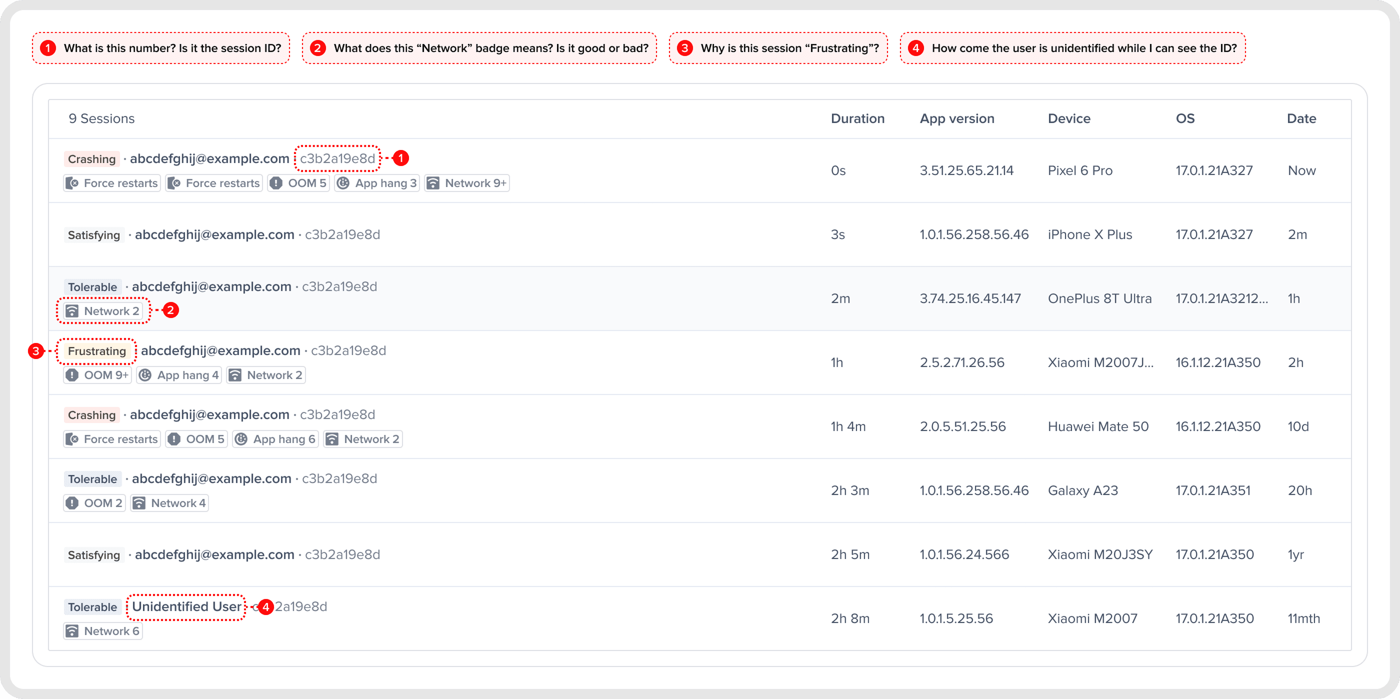
User ID Confusion
"I always thought it was the ID of the session and not the ID of the user." — CarMax · "This ID is not clear to me. Is it the anonymous user ID or the ID of the session?" — Cummins
Badges Misunderstood
"Could you explain what network 9+ means? I don't know." — CarMax · "Until I play the session, I can't understand what these badges represent." — Cummins
Severity Isn't Obvious
"I'm not sure how these 'frustrating' tags are calculated." — Property Finder
Unidentified User
"Even though we're identifying users with an ID, the UI still says 'Unidentified user' — which is misleading." — CarMax
Problem
The problem.
The Session Replay (SR) list view was populated with ambiguous parameters, especially on the left side, making it difficult for users to:
- 01
Recognize the meaning of badges and metrics
- 02
Identify what each piece of information represents
- 03
Understand session severity levels without diving into session details
- 04
Clarify user identity without "Unidentified User" messages
Goals
What we set out to do.
The primary objective was to streamline the user experience while interacting with session data, which involved making critical adjustments to the UI and terminology.
#1
Increase the clarity of session information by making labels more descriptive.
#2
Improve scannability through layout improvements.
#3
Reduce the need to open individual sessions for context.
#4
Clarify ambiguous terminology like "Unidentified User" and badges.
Data analysis
How many badges can be displayed, and in what order?
We analyzed real session data to determine:
- ·
Which metrics were most frequently used across sessions?
- ·
The optimal number of badges to display to preserve clarity without overwhelming users.
We then validated the top-shown badges and prioritized a consistent max count of 4–5 badges per session, based on recurrence and perceived importance across real data sets.
| Tags | Count | Percentage |
|---|---|---|
| 0 | 12,239,357,019 | 89.65% |
| 1 | 950,137,856 | 6.96% |
| 2 | 315,704,193 | 2.31% |
| 3 | 100,464,919 | 0.88% |
| 4 | 23,122,338 | 1.17% |
| 5 | 3,312,312 | 0.124% |
| 6 | 656,086 | 0.0047% |
| 7 | 17,833 | 0.0003% |
| 8 | 46 | 0.0000003% |
Data from 1 month of sessions
Solution (iteration #1)
We focused on restructuring the information architecture of the Session Replay table to establish a clearer hierarchy and reduce cognitive load.
- 01
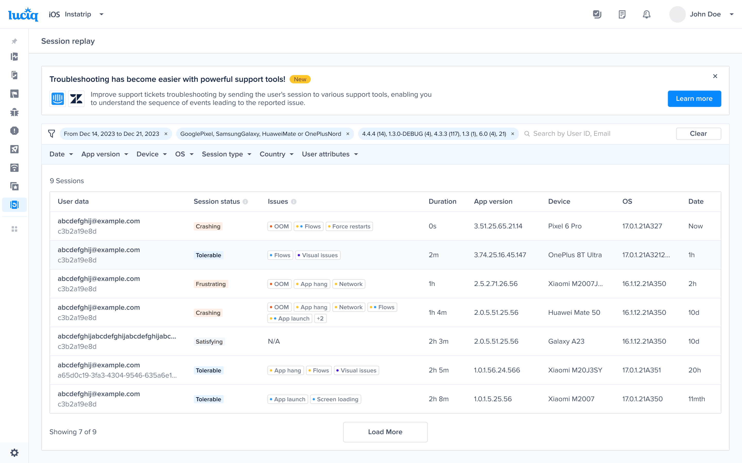
Introduced dedicated columns for user ID, email, session status, and badges.(Problem 1, 3)
- 02
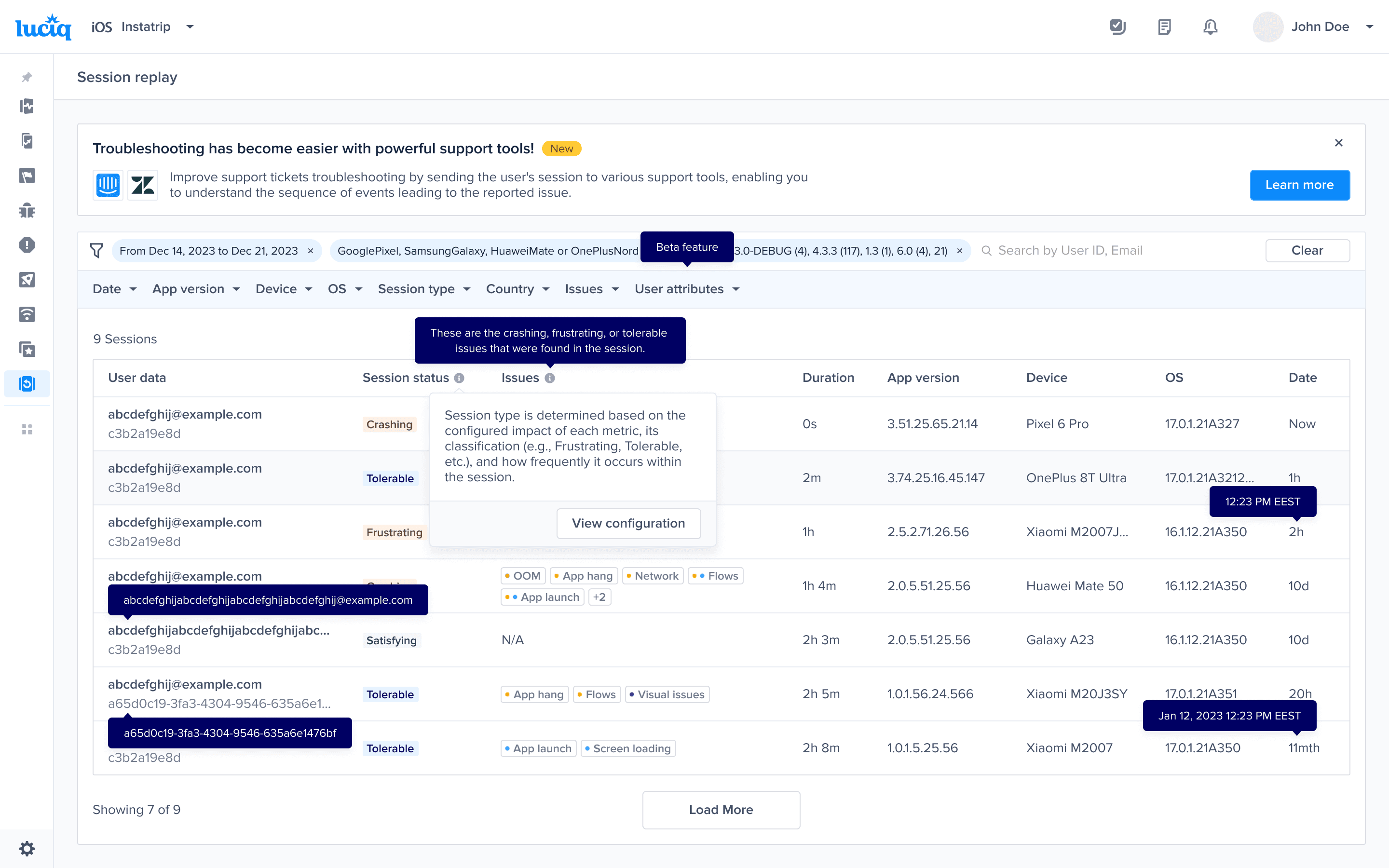
Provided consistent explanations across the interface using tooltips to minimize guesswork.
- 03
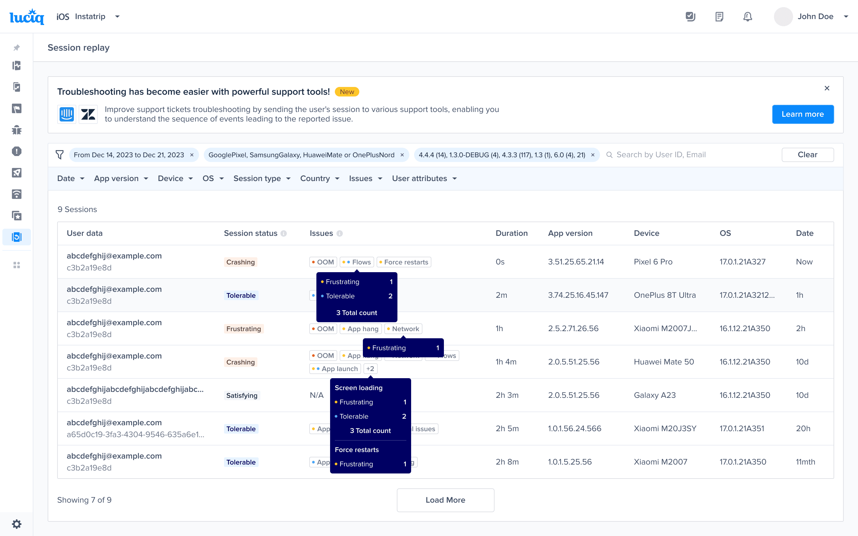
Added severity colors to the issues badges to quickly spot critical signals without navigating cluttered details.(Problem 2)
- 04
If email/name isn't available, display "Anonymous" instead of "Unidentified User".(Problem 4)
Final solution
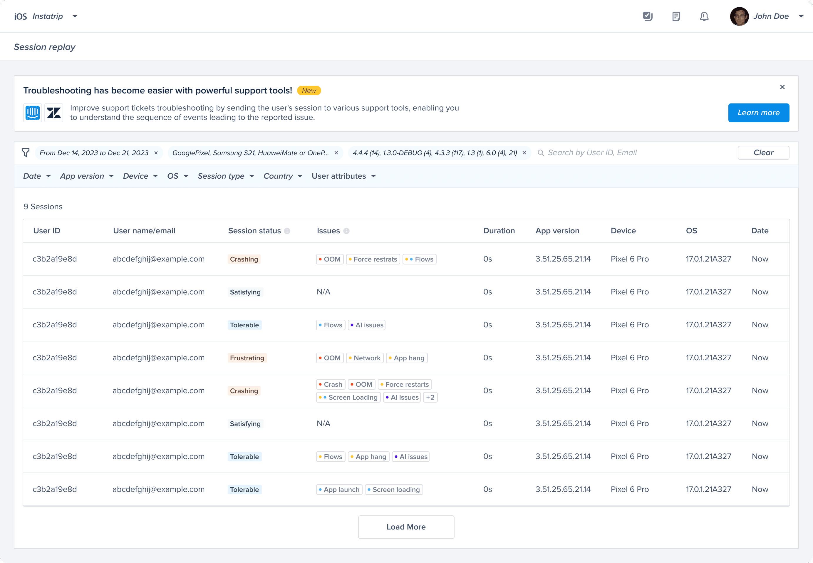
✨ The Final Solution
Following feedback from the product review and usability testing (including a color-blind participant), we refined the design to improve clarity and accessibility:
- 01
User Info Column Combined user ID and email into one field, with a fallback to "Anonymous."
- 02
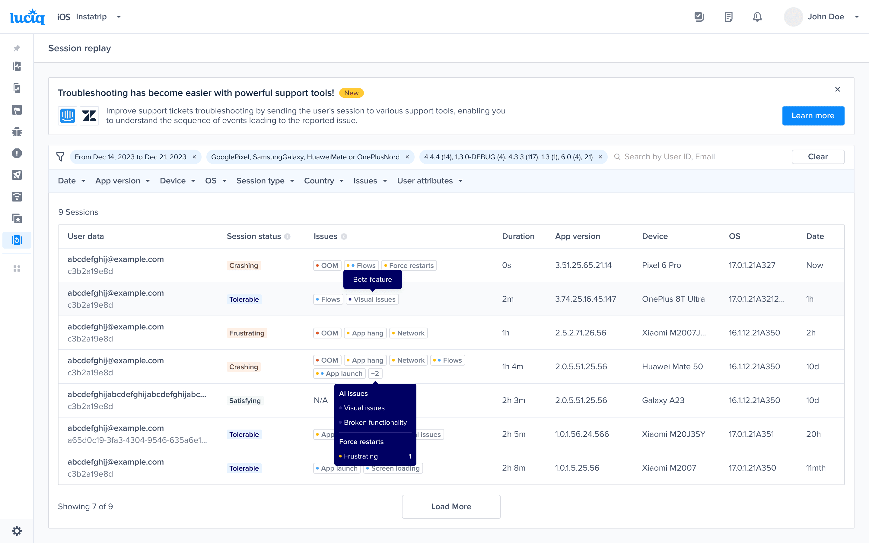
Issues column Provided tooltips to support accessibility.
Impact data
Adoption doubled.
After rollout, support tickets related to SR list confusion dropped 30%, and enterprise customers doubled from 7 to 14 within 4 months.
Outcome
Enterprise customers, MAC over time
Real impact data
Before release
7 customers
4 months later
14 customers ↑ 2×
30%
Drop in support tickets
Related to SR list confusion
2×
Enterprise customer growth
7 → 14 active customers in 4 months
Reflection
“Real data and insights validation early in the process gave the team confidence to make decisions without endless debate.”